When I first envisioned my ideal blog, I knew it had to meet one requirement: it had to be legible as heck (yeah, that’s really legible). The most well-designed blogs I’d encountered had terrific typography, and comfortable font sizes that were just plain fun to read, even on a skinny device like an iPhone.
As luck would have it, this is one area where the default Jekyll theme is lacking. The default theme definitely works on mobile, but it doesn’t take into account best practices like keeping your line lengths between 50 and 75 characters and pumping up your base font-size to keep text readable on smaller devices.
Increasing the font size sounded like child’s play, so I got right to it. Here are the results on an iPhone 5:
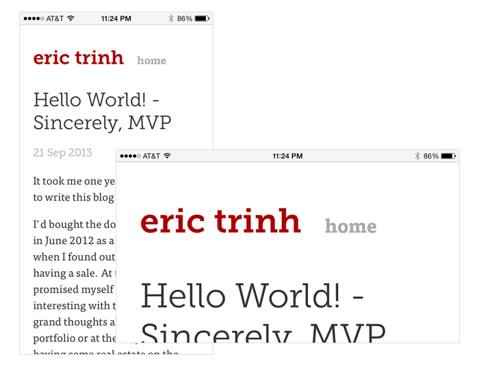
Fantastic in portrait, but the text just gets enormous in landscape! What!?
Turns out this is due to mobile Safari optimizing the font size for you. There’s some automatic font size boosting that goes on when you’re in landscape mode, which is great for reading 99% of the web, but not for your CSS-media-query-optimized webpage.
Well, how do you turn this off? Two shining knights to the rescue: viewport initial scale and text-size-adjust.
Setting your viewport is as simple as appending this charming fellow into the <head> of your HTML document:
<meta name="viewport" content="width=device-width, initial-scale=1.0">
This will set the viewport (the visible area of the page on your device) to the device’s width and the initial scale (how far zoomed in you are) to 1.0 (not zoomed in). The important bit is the initial scale. Without it, mobile Safari’s text auto-sizing algorithms will beef up your text to disgusting, steroidal proportions.
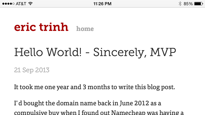
If you just set the viewport initial scale, you’ll notice a huge improvement in the way your page looks now. Behold:
Problem fixed! Except, now do this fun and fruitful exercise. Rotate the phone to portrait. Now rotate it back to landscape. You’ll get this:
After hitting my head on a blunt table edge for a few minutes, I calmed down and did some investigation.
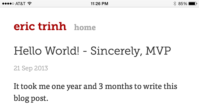
Turns out the viewport initial scale thing, as its name indicates, only sets the initial zoom of the viewport. So, when you rotate your phone, all bets are off. In fact, if I simply hit reload while my phone is in landscape mode, I get the behavior I want:
Unfortunately, not everyone will reload a fresh copy of your page every time they rotate their device. This is where the text-size-adjust CSS property comes in. This property allows you to define exactly how much, if at all, you want the browser to be able to adjust your page’s font size. By default, it’s set to auto, which basically means web browsers can have their way with your text as they please. Not cool.
After a bit of sleuthing, I found many recommendations to do this:
-webkit-text-size-adjust: none;
That will prevent those silly font-size-adjusting algorithms from touching your perfectly laid out text. It works, but it turns out there’s a bug in Safari (the desktop version) and older versions of Chrome that prevents users from adjusting the font size on the page if you set text-size-adjust to none. You’re better off doing this:
-webkit-text-size-adjust: 100%;
You might have noticed the -webkit- prefix. This isn’t a standardized CSS property yet, so you’ll have to do your usual vendor prefixing here:
-webkit-text-size-adjust: 100%;
-moz-text-size-adjust: 100%;
-ms-text-size-adjust: 100%;
And that’s it! Sad to think half my afternoon was wasted by 4 lines of HTML and CSS. I should go find some more rewarding hobbies.